Page 2-3, panel 1: One of the manta rays is missing a tank turret on its back, yet it’s still firing missiles. And just last week I wrote a blog on storytellingyet here I am making stupid mistakes.
Page 2-3, panel 4: Grant doesn’t include SFX in his scripts, so I often find myself adding my own. Usually I try to work them into the flow of the motion. What I’m noticing now is that the only SFX in Joe are the ones I’m adding. I’m not sure if I was supposed to ask for them or what. Oh well.
Page 6-7, panel 3: Grant wanted lots of warrior statues in the shot, so I slipped in some more easter eggs. This one has Robin Hood on the left. I drew this before I knew about the movie.
Page 6-7, panel 4: My favorite panel on the book. I don’t remember if Grant had Joe riding on Jack’s shoulders, but I thought it made sense to show their strengthening companionship. Jack is pretty cold in his dialog, so I balanced him out by showing his warmth for Joe via his actions.
Page 8, panel 1: I loved playing around with Jack’s floating cape and tail.
Page 9, panel 2: The statue on the far left is Dave Johnson, minus his head (which is at the bottom). If you Google “samurai”, Dave’s homemade samurai custom is one of the first images you’ll see. Other people have used it I think, but I’m the first to actually make it Dave Johnson.
Page 10, panel 3: I could draw Zyxy all day long.
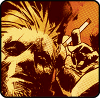
Page 12, panel 1: Jack’s proportions change a lot depending on what he’s doing. Rats have small feet, but bigger feet felt more appropriate because it really nailed him to the ground. And his legs are way more humanoid than a rat, of course. In a way I imagine him as rat-like-kangaroo-wearing-furry-MC-Hammer-pants. This panel shows exactly what I’m talking about.
Page 16-17: Jack’s stance reminds me of The Maxx.
Page 18, panel 2: I’m really glad there’s a word balloon pointing to Joe. Without it, he’d be too small to be noticed.
Page 19, panel 4: The fact that Jack is stabbing the dog through the mouth isn’t clear enough here. The sword is too small to be seen, plus there’s a trail of blood directly next to it that’s the same size, creating conflict and tension between these two shapes. The blood should have been a lot bigger overall.
Page 20, panel 1: I really wanted to flip this panel to show a match cut from the previous page, but the whole scene is reliant on the doorway on panel 4 being on the right side of the page. And I hate when people ignore the 180 degree rule, so the less painful decision was to keep Joe on the left throughout the scene.
Page 20, panel 1: It took me forever to please the SFX just right.
Page 21-22: Hooray for blacks!
Page 24: That dude’s lance is DIRECTLY in the center of the archway and the page. What a shitty design job that was. Also, some of the horse heads are WAY too large. You’ll see me mess up more horses in issue 6. J